Imagine: You and your team have worked hard on a new feature or product for your website or app. You've launched it with high hopes, but wonder how your audience will respond as the days pass.
How about asking for their feedback through Emails? But in the hundreds of emails, it may go unnoticed. Without direct feedback from your users, making informed decisions about improving your products and services is challenging.
It is a problem that many companies face. Fortunately, feedback pop-ups can help you collect feedback directly from your users and gain valuable insights into their needs and wants.
But what are the best practices for pop-up feedback collection? How to ensure your pop-ups are effective and don't drive users away from your site or app?
In this blog, we will explore how you can utilize pop-ups to collect feedback from selecting tools to ensure engaging and effective pop-ups.
Let's dive in.
What Are Pop-ups?
Pop-ups are small windows or dialog boxes that appear on a website or application, often overlaying the main content. They are designed to grab the user's attention and promote a product, service, or content.
When it comes to feedback, pop-ups are an excellent way to collect feedback from your users and make them feel more involved in the process. You can use that to ask for general feedback or specific to a particular feature needing improvement.

Pop-ups can be triggered by various actions, such as clicking on a link, visiting a website, hovering over a specific area on a page, or when a user determines to exit your website.
Mistakes To Avoid While Using Feedback Pop-ups
Though pop-ups can be highly effective, they can also be intrusive and negatively impact the user experience if not implemented carefully. Here are some common mistakes to avoid when using pop-ups for feedback collection:
1. Overwhelming Users With Multiple Questions
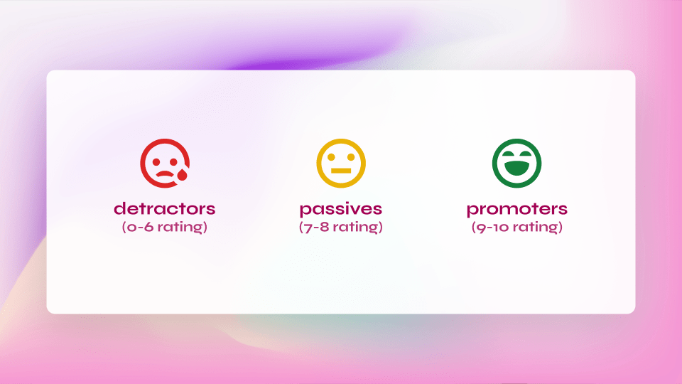
One of the most common mistakes when implementing a pop-up is asking too many questions at once. While some people may be willing to answer all three of your questions, others will not bother answering any of them. The best way to avoid this problem is by asking simple questions or using NPS to collect feedback.

2. Displaying Pop-ups Sooner Or Later In The User's Journey
Imagine using a new feature update on your favorite tool. You're excited about it and want to start using it immediately, but you see a pop-up asking for feedback before you do. It can be annoying because it gets in the way of your actions and makes you lose focus.
On the other hand, if you see the same pop-up after you've been using the new feature for a month, it might not be relevant anymore.
Pop-ups are a great way to collect feedback, but you can use them later in the user's journey. The best time to ask for feedback is after users have used the updated feature for a while. This way, they'll be ready to provide feedback, and it won't feel like an interruption.
3. Using Confusing Or Irrelevant Content In Pop-ups
It's easy to get excited about your new feature and want to share it with everyone. However, the content of your pop-up should be relevant and straightforward. The goal of a pop-up is not only to collect feedback but also to help users understand what they can do with the update.
Thus, ensure that the content of your pop-up is clear and straightforward.
4. Making It Difficult For Users To Close The Pop-up
It may be tempting to make your pop-up hard to close so that users have no choice but to provide feedback. However, this is not a good idea because it will turn them off and make them less likely to provide feedback in the future.
Instead, make it easy for users to close the pop-up by clicking an "X" button or tapping outside the pop-up area.
5. Ignoring Mobile Usability And Responsiveness
If you have a mobile app, ensuring your pop-up is usable on mobile devices is essential. It means ensuring it has a responsive design, allowing it to adjust its size based on the device's screen size.
How To Build A Pop-up For Feedback Collection?
To create a successful pop-up for feedback collection, follow these best practices:
1. Set Clear Objectives
Identify the primary purpose of collecting feedback and the specific information you want. For example, if you want to know about the effectiveness of your new feature, you'll want to focus on asking questions that measure how satisfied users are with it. In this case, you can use the NPS score to assess the overall satisfaction level of users.
If you want to improve your product, ask questions about what could be improved, how frequently they use specific features, and how they feel about them.
If you're looking for general feedback about your product, you can ask open-ended questions and let customers write as much or as little as they'd like.
2. Choose A Tool To Build And Integrate With Your Product
Several tools can help you build, manage and analyze NPS surveys. You should choose one based on your company's needs and the features it offers. For example, if you want to integrate NPS scoring into your product, you must find a tool supporting this feature.
We will explore the best tools later in this article.
3. Choose The Right Timing
As we stated already, the timing of your feedback could significantly impact the data you collect. If you're trying to understand how satisfied customers are with a new feature, sending out your survey right after it's released will likely provide better results than sending it out months later.
Customers are more likely to be aware of the feature and thus have an opinion about it. For example, suppose you're trying to understand how customers feel about a specific experience or issue with your product. In that case, sending out your pop-ups at different times will give you a better idea of how things have changed.
4. Keep It Simple And Concise
Design the pop-up with minimal distractions and focus on a single call-to-action. Ask only necessary questions and avoid extended pop-ups that may discourage users from giving their opinions.
Allow your users to add images if they want to add them. It will help you identify the problem and understand the cause.
5. Make It User-Friendly
Ensure the pop-up is easy to close, and provide options to minimize or dismiss it. The pop-up should also be responsive and adapt to different screen sizes and devices.
Top 3 Tools To Build Your Feedback Pop-ups
Though many free tools are available to build your feedback pop-up, the following are some of the best for you to consider.
1. Olvy
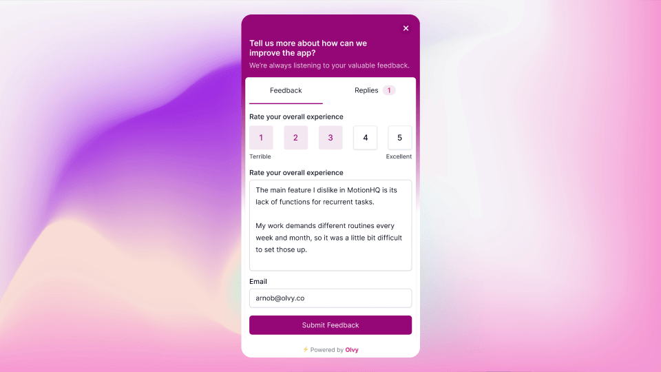
Olvy is an innovative feedback widget that enables you to collect and analyze valuable user feedback. With Olvy, you can create custom feedback forms with advanced features such as multiple-choice questions, open-ended questions, and rating scales. In addition, the widget is highly customizable and can be tailored to meet your specific needs.
Feedback Collection Via Widget Pop-ups
Olvy also offers a range of powerful AI-powered features, including keyword extraction and sentiment analysis, making it easy to understand user feedback and identify pain points. In addition, you can zoom in and out of thousands of feedback responses using the power of GPT-3, providing high-level and detailed insight into user feedback.
Moreover, it allows you to aggregate and cluster similar feedback from multiple users into tasks for your team. It helps to ensure that user needs are prioritized on the roadmap and that feedback is addressed on time.
Furthermore, Olvy can be easily integrated with project management tools for automatic 2-way sync, providing a seamless workflow for addressing user feedback. The platform also offers a single channel for responding to feedback, making it easy for you to close the feedback loop wherever your users are.
2. Popupsmart
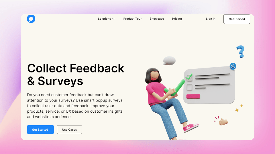
Popupsmart is a tool that you can use to prompt your visitors to provide feedback or answer questions on your website. Customizable with different types of questions such as multiple choice, open-ended, and rating scale questions, pop-up surveys enable you to collect specific feedback and insights from your audience.

By triggering pop-up surveys after a certain amount of time on a page or after a user has completed a specific action, you can capture the attention of your visitors and encourage them to participate in the survey.
This tool offers a range of features that help you create and customize pop-up surveys to align with your brand's messaging and aesthetics so that you can design a better pop-up.
3. Marker.io
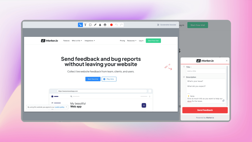
Marker is a web application that you can use to easily capture and report issues, bugs, and feedback on websites and web applications. With Marker, you can take screenshots, annotate them, and provide additional context with notes and metadata, all within the application.

Using Marker simplifies the process of reporting website issues, as you won't need separate tools and platforms for screenshotting, annotating, and reporting. It integrates with popular project management tools such as Trello, Jira, and Asana, enabling you to seamlessly create tickets or issues from your captured screenshots and annotations.
The application's user-friendly interface makes reporting website issues easy and collaborates with your team on resolving them. In addition, its advanced features, such as automatic page metadata and custom fields, help streamline the reporting process and provide more context for developers to reproduce and fix issues.
Wrapping Up
In conclusion, collecting user feedback is essential to enhance your product, service, or content, and pop-ups are an effective tool. However, it is critical to implement them thoughtfully and carefully to maintain a positive user experience. With the perfect tool, you can create a better user experience and collect valuable feedback.
Olvy is a comprehensive and innovative solution among the various feedback collection tools. With its advanced features, such as AI-powered keyword extraction and sentiment analysis, GPT-3 integration, and user-friendly customization options, Olvy enables you to collect, analyze, and understand user feedback more effectively than other tools.
Its seamless integration with popular project management platforms facilitates a smooth workflow for addressing user feedback and prioritizing user needs on your roadmap.
Remember that the most effective feedback collection tools provide actionable user needs and behavior insights. So take the time to invest in a well-designed feedback collection strategy using pop-ups, and watch your customer satisfaction, product improvement, and overall success soar.


