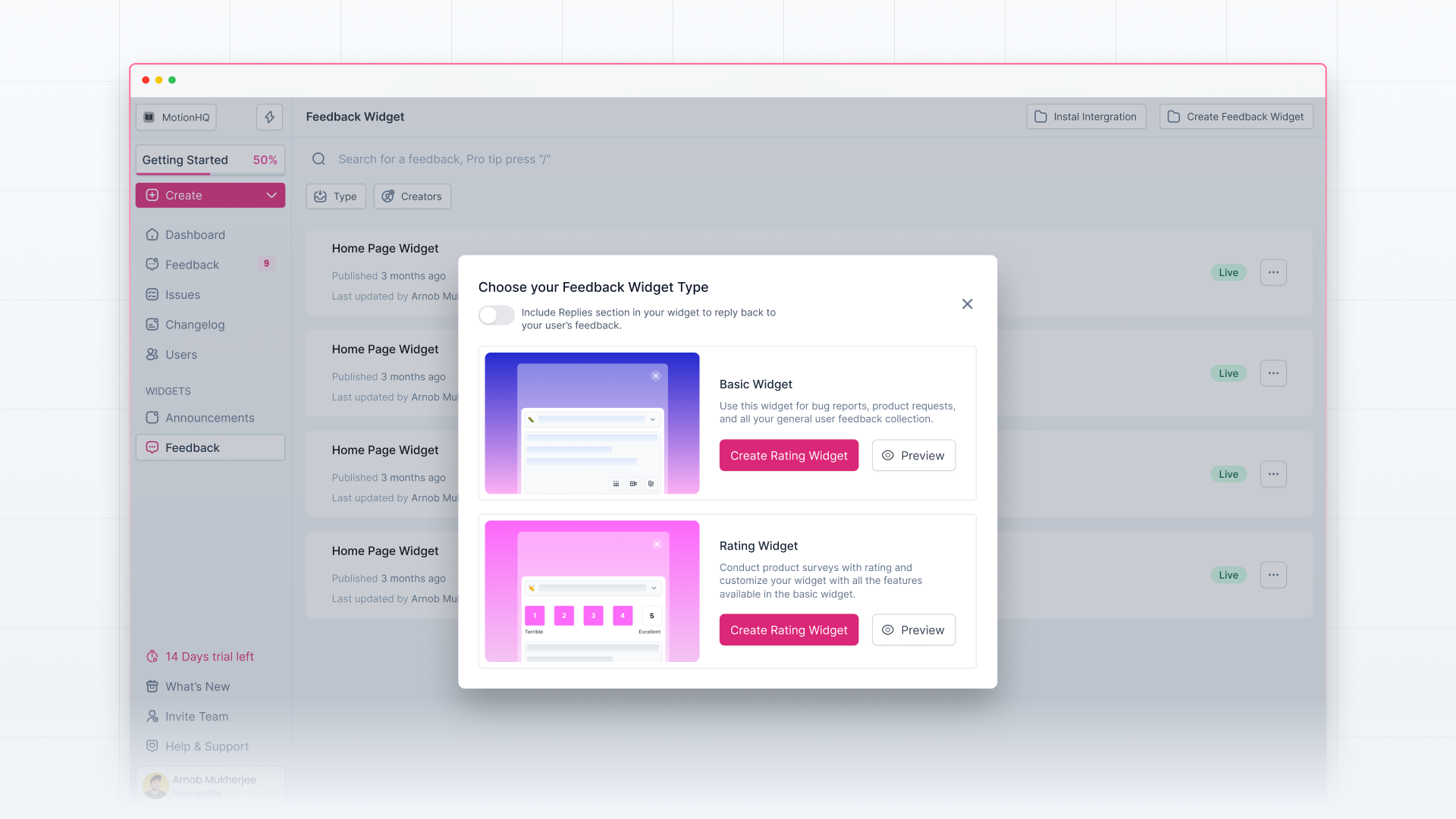
Olvy offers 2 types of widgets – Basic Widget and Rating Widget, best suited for general feedback collection and product surveys, respectively, from directly inside your app. Here's the complete builder breakdown to help you get started –
Choose your Widget Type
As just discussed, Olvy asks you to make this choice so that it can tailor you the editor experience accordingly.
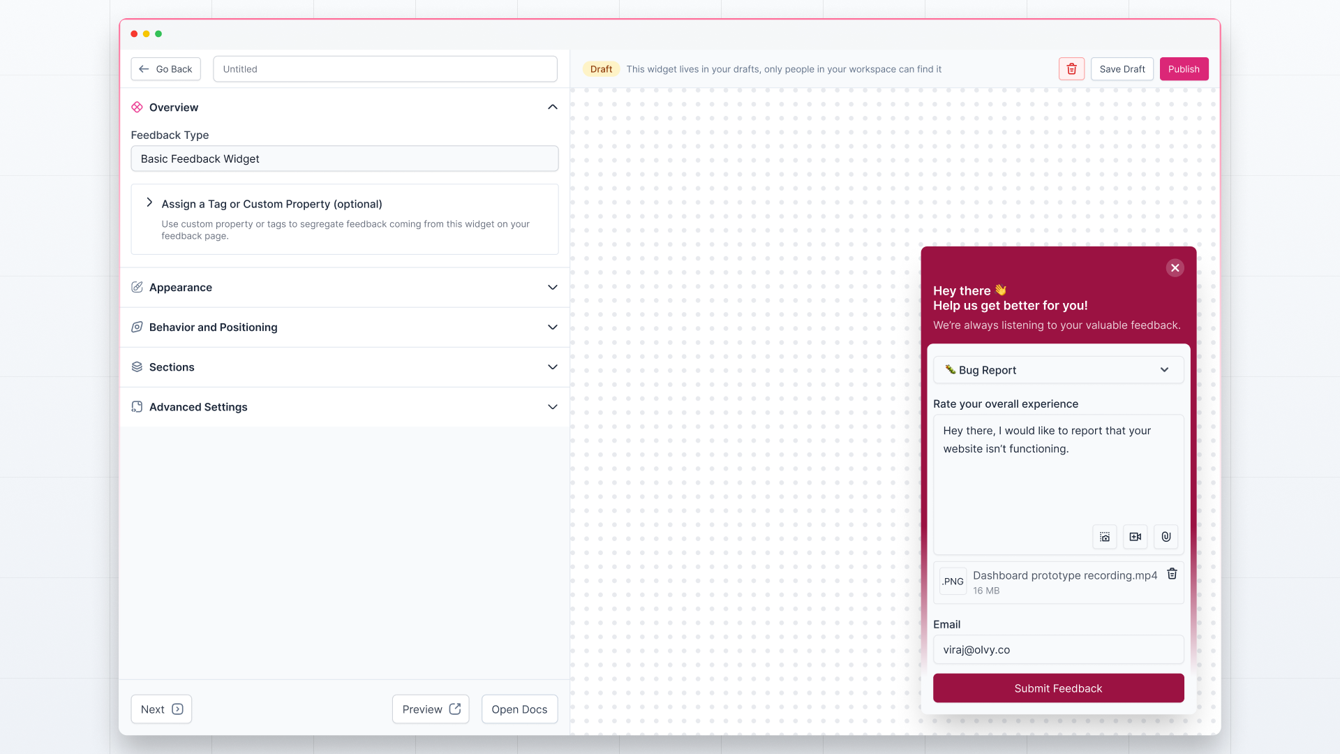
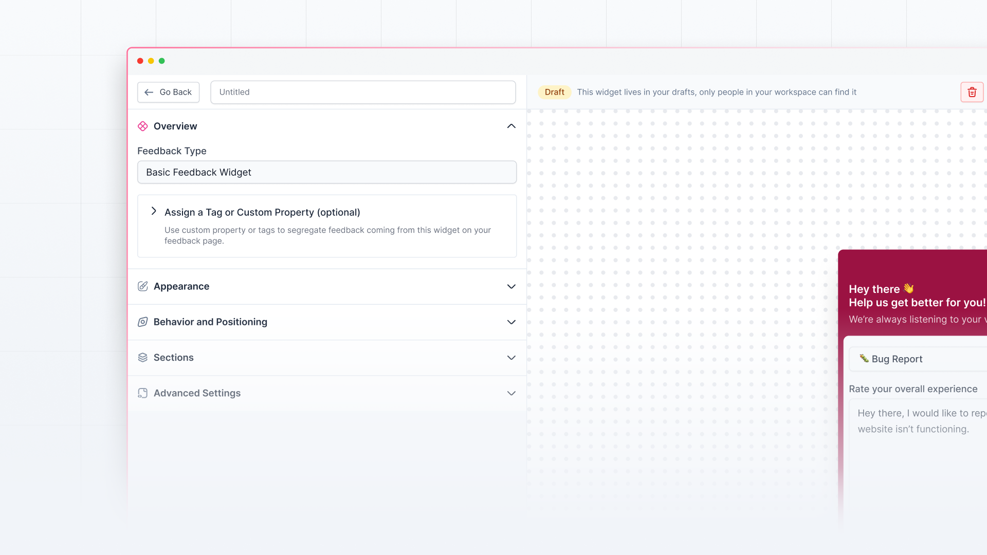
Widget Editor
On the right side, you can preview all your changes to the widget and how it will look in your app. On the left side, you have all the options to customize the widget.
You can either publish the widget, save it to drafts, or delete it permanently by clicking on the action buttons in the top right corner.
Here’re the editing options you’ve on the builder:
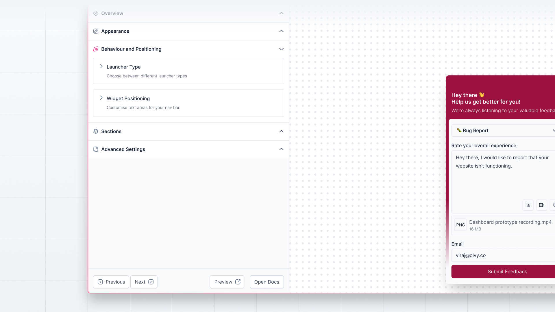
Overview
In the overview, you’ll see the widget type on top.
Next, you can assign tags or custom properties to the widget, which means any feedback you’ll receive from here will automatically have these tags or custom properties assigned, and you can filter the feedback quickly.
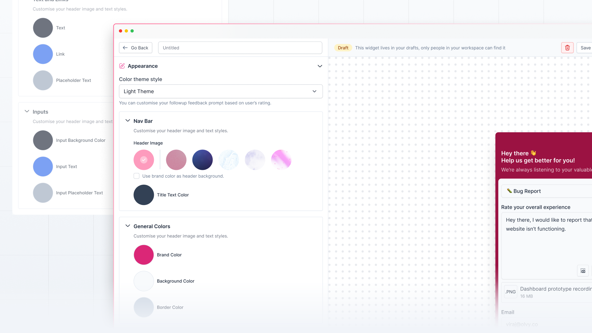
Appearance
Here, as the name suggests, you can change the appearance of your widget:
- Choose the color theme — ‘Only Light Mode’ or ‘Light and Dark Mode'
- Add your brand color to the widget and choose to show the widget overlay.
- Customize the header and other parts of the widget.
- Change the text color and link colors.
- Customize the input background, text, and placeholder color.
Behavior and Positioning
Here, you can customize the widget's launcher type and position:
- Choose between two launcher types — Floating button and Selector.
- Customize the widget position (where the widget will launch on the screen).
If you’re customizing Feedback Widget with Rating, you can enable the Widget Auto Open to prompt the user to fill out the survey. In this, you can:
- Enable snooze interval on Widget Auto Open and add the duration for the snooze
- Disable Auto Open if the user has submitted the feedback
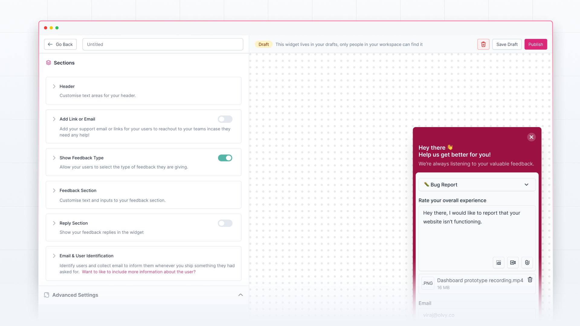
Sections
Here, you can customize multiple things in the widget, such as you can:
- Customize the header text and add a support button to the widget for users to reach out
- Choose whether to let users also mention the feedback type. You can also make it a pre-selected feedback-type widget to save users’ efforts.
- Customize the feedback placeholder and submit button text
- Customize the title and email input placeholder if the user is not identified. You can also choose to hide the email once the user has been identified automatically by Olvy or make it necessary for users to enter the email before sending feedback in case the user is not identified.
- Enable the reply section in the widget to close the loop with your users. You can also enable showing a notification popup and sending email notifications to users on sending replies to feedback received via the widget.
- You can also customize the notification title and choose whether to show your logo in the notification.
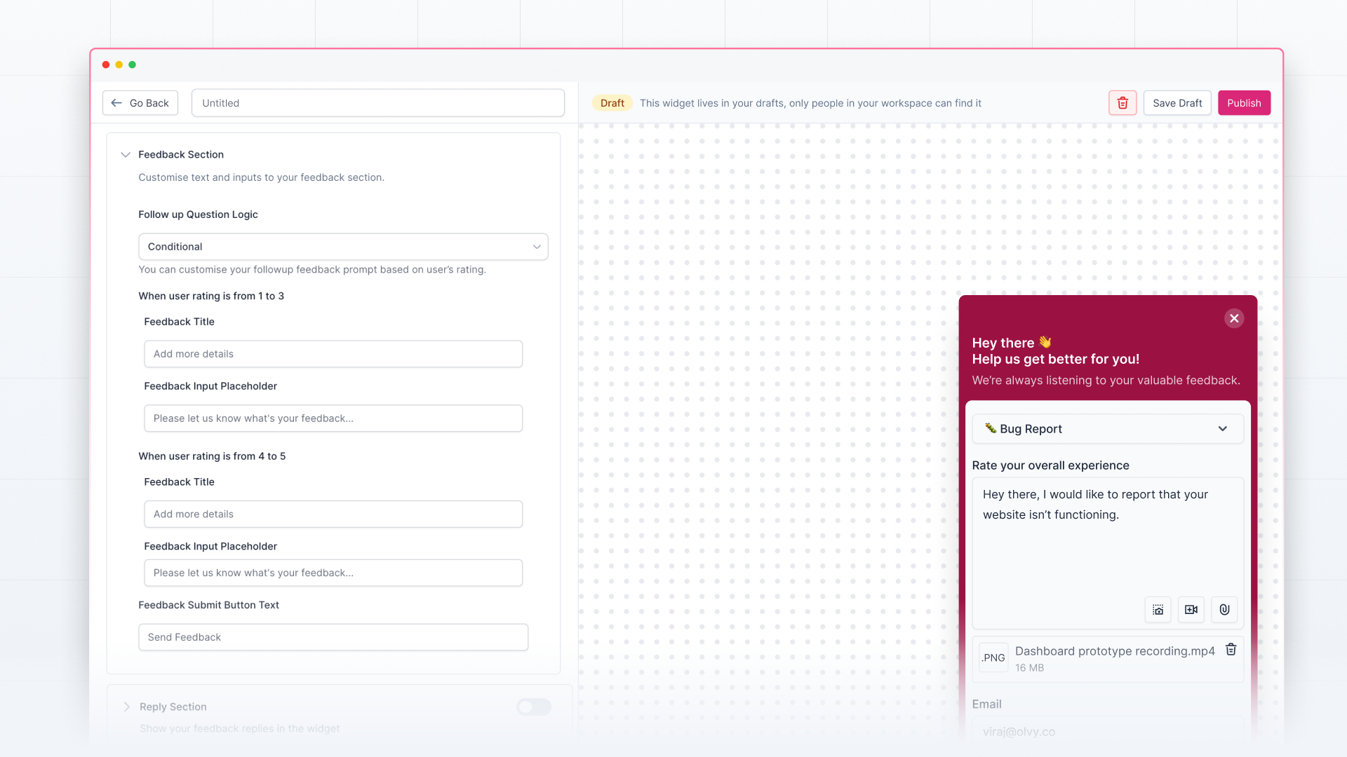
If you’re customizing a Feedback Widget with Rating, you’ll have two more things here:
- Option to customize the Rating title and Scale labels
- Option to customize the follow-up question. You can add a standard or conditional question based on the user rating.
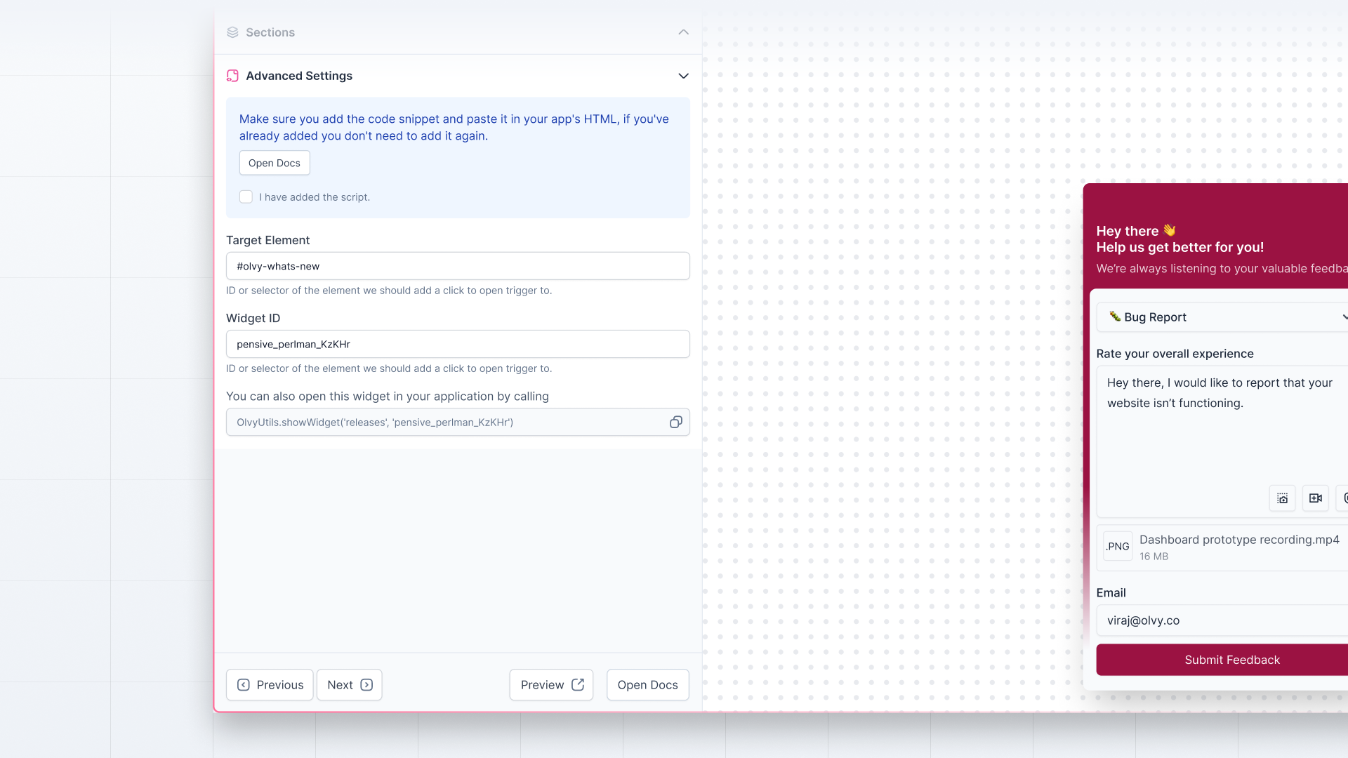
Advanced Settings
Here, you’ll find advanced customization options for your widget:
- Add page rules to the widget to select which pages you want to show the widget on
- Add custom CSS and override the default CSS of the widget
- Add custom JavaScript without script tags
At last, you can see the widget id that you can use to call the widget in your application.
Now, you can start creating and customizing the widget to launch it in your app for your users. If you need any help with setting up the widget, check out the detailed documentation here.